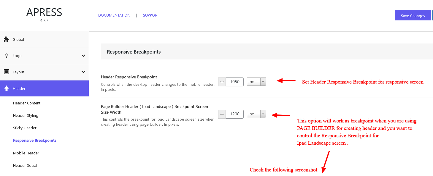
Header Responsive Breakpoint – Controls when the desktop header changes to the mobile header. In pixels.
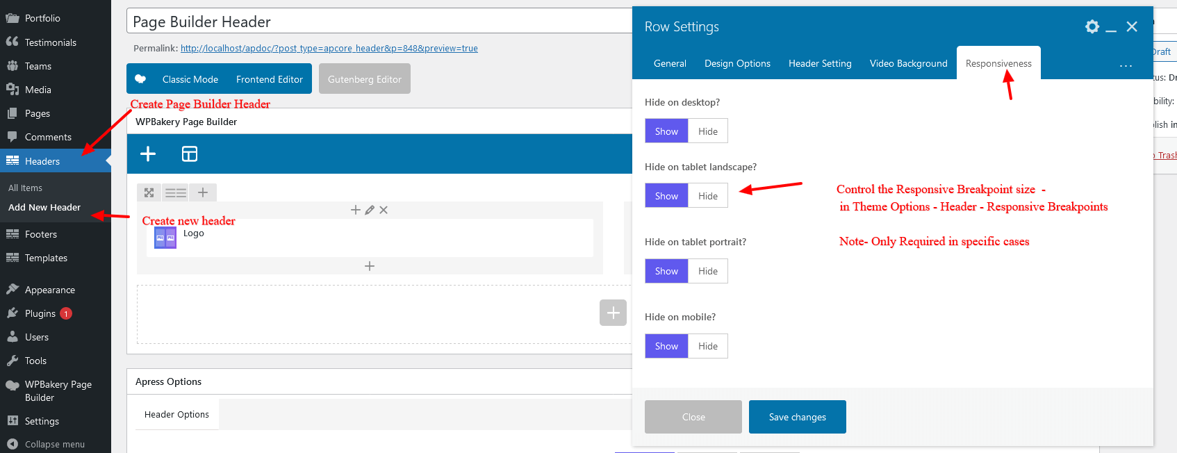
Page Builder Header ( Ipad landscape ) Breakpoint Screen Size Width – This controls the Responsive breakpoint for the Ipad Landscape mode present in the Page builder Header Row Responsive. Its required in some cases where header is created using Page Builder. Check screenshot for more details.